ShopDreamUp AI ArtDreamUp
Deviation Actions
Abstract art uses a visual language of form, color and line to create a composition which may exist with a degree of independence from visual references in the world.
Imagine these gorgeous textures below framed or better yet, on stretched canvas hanging on your wall!

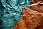

:thumb111735639:
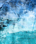


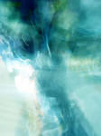

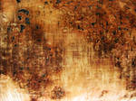
When creating or photographing a texture or even when choosing a texture to use in your art, keep in mind the overall composition of your image. Composition is one of the fundamental tools an art student is taught.
Composition is the placement or arrangement of visual elements or ingredients in a work of art, as distinct from the subject of a work. It can also be thought of as the organization of the elements of art according to the principles of art.
The principles of art are a set of guidelines of art that are to be considered when considering the impact of a piece of artwork. The principles are movement, unity, variety, balance, emphasis, contrast, proportion, and pattern.
Unity
Unity or harmony is the quality of wholeness or oneness that is achieved through the effective use of the elements and principles of art. The arrangement of elements and principles to create a feeling of completeness.
Variety
Variety (also known as alternation) is the quality or state of having different forms or types. The differences which give a design visual and conceptual interest: notably use of contrast, emphasis, difference in size and color.
Balance/
Balance is arranging elements so that no one part of a work overpowers, or seems heavier than any other part. The three different kinds of balance are symmetrical, asymmetrical, and radial.
Symmetrical (or formal) balance is when both sides of an artwork, if split down the middle, appear to be the same. The human body is an example of symmetrical balance.
The asymmetrical balance is the balance that does not weigh equally on both sides.
Radial balance is equal in length from the middle. An example is the sun.
Contrast
In an artwork by combining elements to create interest. Contrast is to provide an artwork with something interesting to break the repetitions.
Proportion
Proportion is a measurement of the size and quantity of elements within a composition. In ancient arts, proportions of forms were enlarged to show importance. This is why Egyptian gods and political figures appear so much larger than common people. The ancient Greeks found fame with their accurately-proportioned sculptures of the human form. Beginning with the Renaissance, artists recognized the connection between proportion and the illusion of 3-dimensional space.
Pattern
Pattern and rhythm (also known as repetition) is showing consistency with colors or lines. Putting a red spiral at the bottom left and top right, for example, will cause the eye to move from one spiral, to the other, and everything in between. It is indicating movement by the repetition of elements. Rhythm can make an artwork seem active.
Imagine these gorgeous textures below framed or better yet, on stretched canvas hanging on your wall!
:thumb111735639:
When creating or photographing a texture or even when choosing a texture to use in your art, keep in mind the overall composition of your image. Composition is one of the fundamental tools an art student is taught.
Composition is the placement or arrangement of visual elements or ingredients in a work of art, as distinct from the subject of a work. It can also be thought of as the organization of the elements of art according to the principles of art.
The principles of art are a set of guidelines of art that are to be considered when considering the impact of a piece of artwork. The principles are movement, unity, variety, balance, emphasis, contrast, proportion, and pattern.
Unity
Unity or harmony is the quality of wholeness or oneness that is achieved through the effective use of the elements and principles of art. The arrangement of elements and principles to create a feeling of completeness.
Variety
Variety (also known as alternation) is the quality or state of having different forms or types. The differences which give a design visual and conceptual interest: notably use of contrast, emphasis, difference in size and color.
Balance/
Balance is arranging elements so that no one part of a work overpowers, or seems heavier than any other part. The three different kinds of balance are symmetrical, asymmetrical, and radial.
Symmetrical (or formal) balance is when both sides of an artwork, if split down the middle, appear to be the same. The human body is an example of symmetrical balance.
The asymmetrical balance is the balance that does not weigh equally on both sides.
Radial balance is equal in length from the middle. An example is the sun.
Contrast
In an artwork by combining elements to create interest. Contrast is to provide an artwork with something interesting to break the repetitions.
Proportion
Proportion is a measurement of the size and quantity of elements within a composition. In ancient arts, proportions of forms were enlarged to show importance. This is why Egyptian gods and political figures appear so much larger than common people. The ancient Greeks found fame with their accurately-proportioned sculptures of the human form. Beginning with the Renaissance, artists recognized the connection between proportion and the illusion of 3-dimensional space.
Pattern
Pattern and rhythm (also known as repetition) is showing consistency with colors or lines. Putting a red spiral at the bottom left and top right, for example, will cause the eye to move from one spiral, to the other, and everything in between. It is indicating movement by the repetition of elements. Rhythm can make an artwork seem active.

Texture Tuesday- Creating Light With Textures
Whether it's a subtle enhancement or vivid color, textures can be a wonderful resource in the lighting of an artwork. With the right texture and blending mode you can really make an artwork pop!
Below are a few examples of artworks using texture to create or enhance lighting:
:thumb138706420: to :thumb134809810:
:thumb79076478: to :thumb170429062: :thumb94197986:
:thumb99823991: to :thumb113993252: :thumb178734907:
:thumb63392019: to :thumb154711983: :thumb108897291:
More light textures!!!
:thumb86996906: :thumb117529695: :thumb161520796: :thumb91267427:
:thumb104279762: :thumb141317684: :thumb25955965: :thumb88197942:
:thumb76723
Texture Tuesday - Autumn 2010
In Autumn, not only do the colors in nature seem richer and more mellow, but textures also assume a more dominant role. In this season we see heavier fabrics and textures, and deeper colors.
The phrase colors of autumn always brings browns, deep oranges and dark reds to mind. Copper, bronze, gold and shades of ginger are also there. Autumn colorings are all darker shades of standard colors and almost always have a warm cozy feeling about them…
The most popular Autumn textures are those of or containing leaves or leaf patterns. But there are many other natural textures that come to mind in this season. Rough bark and stone, dried plants
It's All About Textures
NEWS
I'm excited to announce that I am now a vendor at PaintedOnMySoul (https://www.deviantart.com/paintedonmysoul)'s new website PNGTUBES.COM There's a wonderful selection of tubes and premades to be found, and new free gifts have been posted also. check it out!
Theres an exciting new structure to the Textures gallery! Read More About It at the communityrelations (https://www.deviantart.com/communityrelations) blog. :excited:
I've begun my Texture Tuesday news article again! You can read the newest from the link below! :below:
You will also be seeing some NEW stock and resources from me very shortly. I took a road trip out to South Dakota over the summer and brought back a ton of stock images! I have a lot of good stu
Texture Tuesday - Texture Groups!
This week I decided to spotlight the texture specific groups here on dA.
Stock and resource groups are a great way to showcase your textures and help to promote your work. They can be an inspiration to you for creating new styles or types of resources and they are a great way to become acquainted with other stock providers on dA.
For artists stock and resource groups are a great alternative to browsing through page after page of stock in the dA galleries for what they need. Groups can save you time by having a specific type of stock or resource (in this case textures) in one convenient place. Some resource groups even showcase the artworks
© 2010 - 2024 Gloria-Gypsy-Designs
Comments17
Join the community to add your comment. Already a deviant? Log In
I'm saving this advice so I can use it in the future.